Friday, December 17, 2010
New Android Project Underway
I've singed an NDA (Non-Disclosure Agreement), which means I can't talk about it. However, the picture above pretty much sums it up. I'll be posting more about it once the project is complete, which I think will be after CES.
Wednesday, November 24, 2010
Position from Depth
I've been doing some stuff at work using our visualization, shaders and some python scripting. I normally don't post stuff about work for many reasons, but this project has been a lot of fun and is worth blogging about (and I have permission). I also want to document what I did as well as address some of the issues I encountered.
Essentially, long story short, we're doing some human safety systems work where we need to detect where a human is in an environment. I'm not directly involved with that part of the effort, but the team that is is using some depth cameras (like Kinect in a way) to evaluate the safety systems. Our role, and mine specifically, is to provide visualization elements to meld reality and simulation and our first step is to generate some depth data for analysis.
We started by taking our Ogre3D visualization and a co-worker got a depth of field sample shader working. This first image shows a typical view in our Ogre visualization. The scene has some basic elements in world space (the floor, frame and man) and others in local space (the floating boxes) we can test against.
The next image shows the modifications I made to the depth shader. Instead of using a typical black and white depth image, I decided to use two channels, the red and green channels. The blue channel is reserved for any geometry beyond the sensor vision. Black is depth less, essentially no geometry exists there.
I decided to use two color channels for depth, to improve the accuracy. That's why you see color banding, because I hop around both channels. If I only used one channel, at 8 bit, that would be 256 colors. A depth of 10 meters would mean that the accuracy would only be about 4 cm (10.0 m / 256). By using two color channels I'm effectively using 16 bit, for a total of 65536 colors (256 * 256), which increased our accuracy to 1.5 mm (10.0 m / 65536). In retrospect, perhaps I could have used a 16 bit image format instead.
To do this sort of math its surprisingly easy. Essentially you find the depth value right from the shader and make it a range of 0 to 1, with 1 being the max depth. Since we are using two channels, we want the range to be between 0 and 65536, so just take the depth and multiply by 65536. Determining the 256 values for each channel is pretty easy too using the modulus. (A quick explanation of a modulus is like 1pm = 13. It's when numbers wrap around. So the modulus of 13 by 12 is 1 for example, as is 25 = 1. You could also consider it the remainder after division.) So the red channel is determined by the modulus of depth by 256. The green channel is done similarly, but in this case is determined by the modulus of depth/256 by 256.
red channel = modulus(depth, 256)
green channel = modulus(depth/256, 256)
Here's an example. Lets say the depth is 0.9. That would result in a color value of 58982.4 (0.9 * 65536). The red channel color would be the modulus of 58982.4 by 256, which equals 102. The green channel would be the modulus of 58982.4/256 by 256, which is 230.
With that done, I save out the image representing the depth with two channels as I illustrate above.
Next I calculate the position from the image and depth information. This particular aspect caused me lots of headaches because I was over-complicating my calculations with unnecessary trigonometry. It also requires that you know a some basic information about the image. First off, it has to be symmetric view frustum. Next, you need to know your field of views, both horizontal and vertical, or at least one and the aspect. From there its pretty easy, so long as you realize the depth is flat (not curved like a real camera). Many of the samples out there that cover this sort of thing assume the far clip is the cut off, but in my case I designed the depth to be a function of a specified depth.
I know the depth by taking the color of a pixel in the image and reversing the process I outlined above. To find the x and y positions in the scene I take a pixel's image position as a percentage (like a UV coordinate for instance), then determine that position based off the center of the image. This is really quite easy, though it may sound confusing. For example, take pixel 700, 120 in a 1000 x 1000 pixel image. The position is 0.70, 0.12. The position based on center is 0.40, -0.76. That means that the pixel is 40% right of center, and down 76% of center. The easiest way to calculate it is to double the value then minus 1.
pixelx = pixelx * 2 - 1
pixely = pixely * 2 - 1
To find the x and y positions, in local coordinates to the view, its some easy math.
x = tan(horizontal FOV / 2) * pixelx * depth
y = tan(vertical FOV / 2) * pixely * depth
z = depth
This assumes that positive X values are on the right, and positive Y values are down (or up, depending on which corner 0,0 is in your image). Positive Z values are projected out from the view.
To confirm that all my math was correct I took a sample depth image (the one above) and calculated the xyz for each pixel then projected those positions back into the environment. The following images are the result.
The results speak for themselves. It was a learning process, but I loved it. You may notice the frame rate drop in the later images. That's because I represent the pixel data with a lot of planes, over 900,000. It isn't an efficient way to display the data, but all I wanted was confirmation that the real scene and the calculated positions correspond.
Essentially, long story short, we're doing some human safety systems work where we need to detect where a human is in an environment. I'm not directly involved with that part of the effort, but the team that is is using some depth cameras (like Kinect in a way) to evaluate the safety systems. Our role, and mine specifically, is to provide visualization elements to meld reality and simulation and our first step is to generate some depth data for analysis.
We started by taking our Ogre3D visualization and a co-worker got a depth of field sample shader working. This first image shows a typical view in our Ogre visualization. The scene has some basic elements in world space (the floor, frame and man) and others in local space (the floating boxes) we can test against.
 |
| A sample scene, showing the typical camera view. The upper-right cut-in is a depth preview. |
 |
| Two color channel depth output image. |
To do this sort of math its surprisingly easy. Essentially you find the depth value right from the shader and make it a range of 0 to 1, with 1 being the max depth. Since we are using two channels, we want the range to be between 0 and 65536, so just take the depth and multiply by 65536. Determining the 256 values for each channel is pretty easy too using the modulus. (A quick explanation of a modulus is like 1pm = 13. It's when numbers wrap around. So the modulus of 13 by 12 is 1 for example, as is 25 = 1. You could also consider it the remainder after division.) So the red channel is determined by the modulus of depth by 256. The green channel is done similarly, but in this case is determined by the modulus of depth/256 by 256.
red channel = modulus(depth, 256)
green channel = modulus(depth/256, 256)
Here's an example. Lets say the depth is 0.9. That would result in a color value of 58982.4 (0.9 * 65536). The red channel color would be the modulus of 58982.4 by 256, which equals 102. The green channel would be the modulus of 58982.4/256 by 256, which is 230.
With that done, I save out the image representing the depth with two channels as I illustrate above.
Next I calculate the position from the image and depth information. This particular aspect caused me lots of headaches because I was over-complicating my calculations with unnecessary trigonometry. It also requires that you know a some basic information about the image. First off, it has to be symmetric view frustum. Next, you need to know your field of views, both horizontal and vertical, or at least one and the aspect. From there its pretty easy, so long as you realize the depth is flat (not curved like a real camera). Many of the samples out there that cover this sort of thing assume the far clip is the cut off, but in my case I designed the depth to be a function of a specified depth.
I know the depth by taking the color of a pixel in the image and reversing the process I outlined above. To find the x and y positions in the scene I take a pixel's image position as a percentage (like a UV coordinate for instance), then determine that position based off the center of the image. This is really quite easy, though it may sound confusing. For example, take pixel 700, 120 in a 1000 x 1000 pixel image. The position is 0.70, 0.12. The position based on center is 0.40, -0.76. That means that the pixel is 40% right of center, and down 76% of center. The easiest way to calculate it is to double the value then minus 1.
pixelx = pixelx * 2 - 1
pixely = pixely * 2 - 1
To find the x and y positions, in local coordinates to the view, its some easy math.
x = tan(horizontal FOV / 2) * pixelx * depth
y = tan(vertical FOV / 2) * pixely * depth
z = depth
This assumes that positive X values are on the right, and positive Y values are down (or up, depending on which corner 0,0 is in your image). Positive Z values are projected out from the view.
To confirm that all my math was correct I took a sample depth image (the one above) and calculated the xyz for each pixel then projected those positions back into the environment. The following images are the result.
 |
| Resulting depth data to position, from the capture angle. |
 |
| The position data from depth from a different angle. |
 |
| The position data from depth from a different angle. |
Saturday, November 20, 2010
Call of Duty Black Ops Takes 8 Lives in One Day
Eight lifetimes were spent playing Call of Duty Black Ops on XBOX Live by then end of launch day on November 9th. Sensational, I know, but let me explain.
I've always found this math concept interesting, where you compare lifetimes to an event, especially if you equate it to big events like the Super Bowl. Basicaly any event where they brag about the number of viewers, or hours spent, or time committed to something means that lifetimes were used up. Major Nelsons recent tweet about Call of Duty Black Ops having 5.9 million hours played in the first day reminded me of this strange thought, so I had to find out. How many lifetimes were used playing Call of Duty on that first day?
The math is easy, so let me walk through it.
First off, what is the life expectancy of the average person? I decided to use the US average, since its probably the majority of players and is also fairly high. According to the CIA, the average life expectancy of a US citizen in 2010 is approximately 78 years.
Second is determining how many years 5.9 million hours is. 5,900,000 hours is 245833 days (5900000 hrs / 24 hrs/day) which is 673 years (245833 days / 365 days/year).
The rest is simple. If a lifetime is 78 years, and 673 years were spent playing, that means that 8.6 lifetimes (673 years / 78 years/lifetime) were spent.
What does this mean? Well, nothing really. It's just an interesting number related to life. It doesn't mean lives were wasted, because many many more are spent in more mundane things every day (such as traffic). It's just interesting to see how we spend our time.
I've always found this math concept interesting, where you compare lifetimes to an event, especially if you equate it to big events like the Super Bowl. Basicaly any event where they brag about the number of viewers, or hours spent, or time committed to something means that lifetimes were used up. Major Nelsons recent tweet about Call of Duty Black Ops having 5.9 million hours played in the first day reminded me of this strange thought, so I had to find out. How many lifetimes were used playing Call of Duty on that first day?
 |
| Major Nelson's tweet from Nov. 19th, 2010 |
The math is easy, so let me walk through it.
First off, what is the life expectancy of the average person? I decided to use the US average, since its probably the majority of players and is also fairly high. According to the CIA, the average life expectancy of a US citizen in 2010 is approximately 78 years.
1 lifetime = 78 years
Second is determining how many years 5.9 million hours is. 5,900,000 hours is 245833 days (5900000 hrs / 24 hrs/day) which is 673 years (245833 days / 365 days/year).
5,900,000 hours = 673 years
The rest is simple. If a lifetime is 78 years, and 673 years were spent playing, that means that 8.6 lifetimes (673 years / 78 years/lifetime) were spent.
673 years = 8.6 lifetimes
What does this mean? Well, nothing really. It's just an interesting number related to life. It doesn't mean lives were wasted, because many many more are spent in more mundane things every day (such as traffic). It's just interesting to see how we spend our time.
Friday, November 12, 2010
Deadly Chambers Sales Per Month, Oct
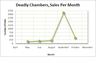
Here's an update plot showing how Deadly Chambers sales are doing. I wish I had more resolution to the trends of this plot, but the only data I get is the monthly run down. The spike in September is a result of our Feature status on the market, and maybe also our marketing efforts and reviews. We expected a decline in October, with the Feature ending, but we had hoped for a little better of course.
I'm still excited to see how we do in the following months.The trend is subtle but upward. My (hopeful) prediction is similar sales numbers.
Sunday, November 7, 2010
First 1000 Gamerscore
I achieved my first 1000 gamerscore tonight, some accomplishment. I've been keeping Borderlands on the back burner, intending to get that last achievement someday. I had to reach level 50, which given their level balancing and the level cap for enemies, is tough.
Saturday, November 6, 2010
Classes are Over
I'm done. My last class final taken and grades are in. I'm done with DeVry. I'm not sure when I "graduate", but I am now completed with my Game and Simulation Programming Bachelors Degree.
I'm pretty meh about the whole DeVry experience. I wish I could put it in words, but I think a lot of it was wasted on me. Well, not wasted. The system is pretty easy to game, but combine that with my 10 years of work experience in "simulation" and I think I've been pretty well trained already.
If you, dear reader, are someone considering the GSP degree, be sure to give it a long thought. I still contend that most would far much better with a Computer Science degree while trying the hobby indie game maker thing on the side. I have no insight into how degree's like this lead into the industry, but nor was I aiming for that. If you've got any questions, let me know.
Onward...
Friday, October 22, 2010
Contest Switch
Anyone whose ever considered graphics art work has probably come across a contest or two. They are easy to set up, you get a number of submissions you get to pick what you like best. Easy. But this is at the expense of the artists of course, and is very annoying when you're looking for legit work.
Image from The Craziest Craigslist Ads Of All Time: Vol. II
Image from The Craziest Craigslist Ads Of All Time: Vol. II
Tuesday, October 12, 2010
Review of the AppJudgement Review of Deadly Chambers
You guys, Anthony Carboni over at AppJudgement recently reviewed Battery Powered Games' Deadly Chambers for Android devices.
WAIT, don't click play yet!
The review isn't favorable even though Anthony is giving it the 5 finger solute there. In fact, considering all the positive reviews and comments we've gotten its surprising the level of which Anthony dislikes Deadly Chambers. If only he knew how much time I spent watching Bytejacker and playing Free Indie Rapid Fire games instead of working on level designs, improving textures and character animations... All the time I spent watching him with enjoyment and laughter, now replaced with a sour taste and sadness... He really didn't seem to like the game. Oh Anthony!!! NOOOOOO!
We are really honored to be reviewed by AppJudgement, don't get me wrong. I've been watching them for over a year now and I've come to enjoy their productions and trust their reviewers (was hoping for Jackie to review to be honest, no offense Anthony). I don't know if Anthony, or the AppJudgement team got my requests for review, or if he found it as he stated (which would be awesome), but being noticed is a plus in and of itself. Even after the review I still love you Anthony, and we are taking many of your thoughts to heart. (WTF, ByteJacker biweekly, you suck! I mean that in the most positive way! I miss you.)
With that said, I have a few major contentions with his review. First off, he sets the stage by saying "a little gaming action for my hardcore friends." Deadly Chambers was never intended as a "hardcore game". It was designed to be a casual shooter, to give you a few minutes of shoot-the-bad-guys fun, and was designed accordingly. It is made for a phone device after all. We did decide to support the more hardcore gamer types by adding a lot of unlockable guns, achievements and a tough "Deadly" difficulty of course, but the designed and intended average time to play a level is pretty quick once you get used to it. Anthony reviewed Deadly Chambers as if it were intended for hardcore gamers so its no wonder he wasn't satisfied. Additionally, he was comparing it to iPhone games. That isn't a problem mind you, because its at least a more fair comparison than comparing it to Xbox360 or PS3 shooters and is appropriate, but it doesn't really matter if you only have an Android Phone. What he also failed to mention was the total lack of any quality 3D shooters available in the Android Market because he was comparing it to iPhone games. If games like Deadly Chambers were easy to make, the market would be flooded with them. Deadly Chambers is one of a kind, for better or worse. It is not NOVA (ported to Android, and whose heard of it other than the hardcore), it is not Quake (this is an OLD PC game remember), and its not supposed to be!
Secondly, he never mentions the bosses. The majority of the game design came in the form of boss fights. From an angry Ogre who can repel your attacks with a giant smiley face shield, a giant spider knight, a mechanized robot with Gatling gun arms whose pilot is its only week point, and a giant dragon that flies around shooting fire at you in a huge castle. The game's boss fights add much to the game as a whole and he never mentioned them. In the game there are 5 enemy models and 6 boss models. Sure, the room to room design isn't the best and the AI of those monsters isn't top notch, but he didn't even mention the level bosses. You shouldn't say something like "enemy AI is simplistic and slow" and ignore the bosses, which he does. (See how mad the Ogre is there, waving his wooden hammer!)
Other little things...
The levels are "bland and boxy" and the characters are "simple". This is so very true, and Anthony goes on later in his video to express the potential fragmentation problem related to this which is also exactly true. To support the myriad of Android devices and OS versions, we were forced to aim lower than I, as the artist and partial designer, would like. However, given that the game has 5 levels, 11 character models, 18 guns and a shit-ton of other images (that is artist talk for amazing Photoshop skillz), all jammed into a 7MB file, its f'ing impressive and I'm super studly for making that possible! Add to that the fact that it runs on so many devices is a testament to the design. We could have made a killer shooter if we target a few phones, Anthony is dead to rights about that, but we would have been ignoring a large portion of the Android audience. Ultimately though, shouldn't this sort of approach be praised instead of condoned. Robert (Battery Powered Games owner, president, etc., etc.) was adamant about supporting older phones (older OSs, back to 1.6) and I eventually came around to his way of thinking (because he's right). Its too big a market to over look, especially at the date of our release. I'm still sporting my G1 for crying out loud! This also correlates tremendously to sales as well as recognition.
One of the major issues with the game is its controls. I for one, have tested on a number of devices, and perhaps I've grown accustomed to its quirks, but it works well for me. However, supporting so many devices causes a whole bunch of unfortunate problems too. Problems that I wish were not there and cause us headaches and stars in the ratings (X10 and Moment for instance). I wont really get into this because its a loosing battle and I'm half drunk, but part of the blame falls on the player, but most of the blame falls onto the Android hardware. Don't believe me? Go to the Application Market and download the some of the Multitouch test apps (Multitouch Visibility Test and Multitouch Paint are a both good ones) and use them in a way you think controls should/could work and see what happens. Here's a video on the Nexus 1 and Droid just for reference. The ultimate problem is that since the Nexus 1 and the Droid both support the same OS, but the touch interface behaves differently and you can't really target a phone directly, you're stuck deciding how to deal with the fallout (bad reviews because phone don't work vs. trying to make it right for one device.)
What saddens me most is that I seriously doubt Anthony played much of the game and this is evident in the video. There are hardly any achievement unlocks and no video past the third level. Some of the complaints about simple models and levels are true, but once you get to the Castle or the Tower levels (levels 4 and 5) I think the levels are outstanding in comparison. The models also get better. I admit, this shooter isn't the 3D Jesus we're all hoping for, but its a step in the right direction. With some actual, honest, unbiased and unrushed gameplay, I think its a solid game worth a look. One worthy of more than the 10 minutes it takes to get to level 3.
Anthony also mentions the characters sliding and twisting awkwardly around the screen, which admittedly is very noticeable. It's also one of those things that I notice and you know where else this is noticable? Fallout 3 and Fable 2, both of which have characters that when running around the environment don't seem to be quite right. I will admit I giggled a little at his reference to Dr. Chambers' running animation looking like something like a puppet from Team America. This was one of those things that I wanted to fix, but ultimately was good enough for what it was. Not too bad for 8 keyframes really. (Still bugs me deep in my core, but not enough to do something about apparently...)
In the end, we are being compared to NOVA and even Rage by AppJudgement, a reputable and respectable organization and I appreciate their time and effort in their review. I respect Anthony and we are taking his, and every other reviewer, blog, fan or mutant out there who took the time to give us a chance, comments to heart. In the end, you should watch Anthony's review because he is good at what he does and I'm all sorts of jealous. Sometimes I wish A-Train wasn't dead... (Insert inside joke here... wait, I already did.)
Oh, and BTW, we've started working on our next game and its going to be awesome!
Labels:
android,
deadly chambers,
funny,
iPhone,
modeling,
video games
Monday, October 11, 2010
Fallout 3, Over 77 Hours of Play!
I just finished Fallout 3 tonight, racking up over 77 hours of game time. I'd say that was a well spend $60 on entertainment.
I reached level 20 about 6 months ago and then stopped playing. (Fallout 3's level cap was 20, so no more character upgrading.) I lost interest I guess, but I remembered really enjoying the game. So after I finished Alan Wake (great game BTW), I told myself to go finish one of the many games I hadn't finished.
I reached level 20 about 6 months ago and then stopped playing. (Fallout 3's level cap was 20, so no more character upgrading.) I lost interest I guess, but I remembered really enjoying the game. So after I finished Alan Wake (great game BTW), I told myself to go finish one of the many games I hadn't finished.
Tuesday, October 5, 2010
Deadly Chambers Sales Per Month
Here's a quick plot showing Deadly Chambers sales per month. I wish I had more resolution to the trends of this plot, but the only data I get is the monthly run down. It's still enough to show the dramatic spike that we had during the month of September. This can be attributed some to our marketing efforts and getting reviewed on various websites. However, I think most of our success was from our Feature status. That, unfortunately, has ended. I hope we can do half as well next month without it.
I'm really excited to see how we do in the following months. If you have any ideas, or friends or acquaintances in the review field for an Android game, please have them contact me.
I'm really excited to see how we do in the following months. If you have any ideas, or friends or acquaintances in the review field for an Android game, please have them contact me.
Friday, October 1, 2010
105 Reviews! 4+ Stars Average!
Today, my Android G1 phone informs me that there are 105 reviews for Deadly Chambers, running a 4+ star rating. Our Featured Game status is over and we had a pretty good month. It's nice to get noticed. I'll try and post a graph or something one I get some numbers. Meanwhile, here are some of my favorite comments:
And here are some of the more comic 1-3 Star reviews.
And just so this post has a graphic attached, here's something I used to convince the developer to add an extra weapon.
"Best game ever for phones"
- Greg
"Impressive. MOST impressive."
- Michael
"HOPEFULLY A SEQUEL LOVE THIS GAME!!!!!!!"
- MRWESKER78
"Best! Android! Game! Yet!"
- nick
"A++ Fast Shipping! ...oh yeah, best Android game ever!"
- sra (I know this is you Steve)
"Good fun this game is."
- Yoda - kevin
"I dont understand how people can complain about such a great game. The controls work great and game play is solid on the nexus one!"
- scott
"It's about time that Android gets a game that rivals the iPhone. I'd give it 10 stars if I could."
- Breon
"Gorgeous game. Really fun to play. Attention to detail is great."
- Darryl
"This game is the bomb grafix r the best I turn them right up on my sony x10"
- J-BAGGS
"Finished the game 4 times, BEST shooter on android! Mytouch Slide"
- Dalton
"By far 1 of best shooters on android market, please make more.. Wolfenstein, or a unique game of your own. We need better games 4 Verizon-android"
- jason
And here are some of the more comic 1-3 Star reviews.
"it never showed me the fire button"
- khalid
"Its ok"
- Maco
And just so this post has a graphic attached, here's something I used to convince the developer to add an extra weapon.
Here's a picture of the Bubble Gun.
This is the last, and most powerful, weapon in Deadly Chambers.
Thursday, September 16, 2010
Deadly Chambers is App of the Week
Deadly Chambers is one of this weeks Android Games of the Week at Appolicious.com: http://appo.me/djit1
Deadly Chambers is Featured, #1
Deadly Chambers has been featured by Google in the App Market! This is great news since it helps us spread the word about the game in the best way possible.
Wednesday, September 15, 2010
Friday, September 10, 2010
Latest Video: The Incident Security Cameras
Not too bad for 6 hours of filming and 4 hours of editing and effects.
This one shows a hallway at the Facility. Things are going along normally when something happens.
After The Incident, the scientist become mind controlled by multi-dimensional aliens (or some other sci-fi type story) and are seen here using some advanced technology.
I'm actually very happy with how it turned out. It was filmed with my old, and apparently trusty, Cannon GL1. Editing and special effects were done in Adobe Premier.
Thursday, July 29, 2010
Wednesday, July 28, 2010
Wii Controller Controls Nexus 1
Although there are a lot of videos about Wii Controllers (after all, they are just Bluetooth) being used with phones, I found this one interesting. Lots of potential here for common users.
Sunday, July 18, 2010
Presenting Android's exclusive Over-The-Shoulder 3D shooter - Deadly Chambers!
It's out in the wild!
Deadly Chambers exclusive to Android powered devices of all makes and models.
Battle your way through 5 levels of baddies and bosses in this epic 3D journey. Deadly Chambers offers stunning graphics, tight gameplay, unique controls and loads of unlockable weapons and achievements.
The following are actual screenshots from a stock Nexus One phone running Android 2.2:

Main Menu
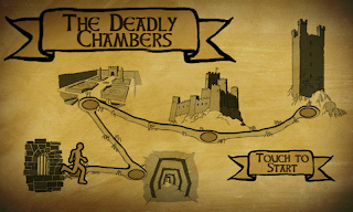
World Map
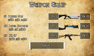
Weapon Equip
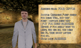
Taunting Letters
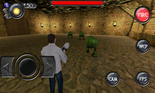
Dungeon Fight
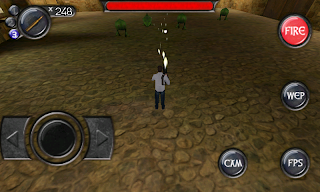
Adjustable Perspective
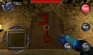
First-Person Shooting
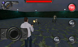
Garden Fight
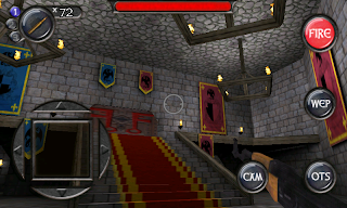
Castle
Deadly Chambers uses OpenGL ES 1.0 and is compatible with most Android phones running 1.5 or higher.
Tips for play:
Try all of the buttons on your phone - by default pressing in on the trackball or dpad center button will fire and surrounding buttons will change weapons and perspective.
Check the game settings - Key bindings, graphics and sound settings are all configurable.
You don't need to equip all 3 weapons - sometimes it works better to just equip one or two very powerful ones.
Enemies are resistant to different weapons - Experiment and find out what works best.
Bosses have weak points - Try shooting at different areas and with different weapons to beat the tougher bosses.
How to get this game? It's available now in the Android market.
Deadly Chambers exclusive to Android powered devices of all makes and models.
Battle your way through 5 levels of baddies and bosses in this epic 3D journey. Deadly Chambers offers stunning graphics, tight gameplay, unique controls and loads of unlockable weapons and achievements.
The following are actual screenshots from a stock Nexus One phone running Android 2.2:

Main Menu

World Map

Weapon Equip

Taunting Letters

Dungeon Fight

Adjustable Perspective

First-Person Shooting

Garden Fight

Castle
Deadly Chambers uses OpenGL ES 1.0 and is compatible with most Android phones running 1.5 or higher.
Tips for play:
Try all of the buttons on your phone - by default pressing in on the trackball or dpad center button will fire and surrounding buttons will change weapons and perspective.
Check the game settings - Key bindings, graphics and sound settings are all configurable.
You don't need to equip all 3 weapons - sometimes it works better to just equip one or two very powerful ones.
Enemies are resistant to different weapons - Experiment and find out what works best.
Bosses have weak points - Try shooting at different areas and with different weapons to beat the tougher bosses.
How to get this game? It's available now in the Android market.
Monday, June 28, 2010
The New Pat
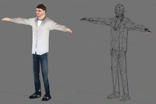
I've created a new lead model for Deadly Chambers. This is the WIP. My triangle budget is 400. This model weighs in at 406. Ha!
Tuesday, June 22, 2010
Senior Design, GSP-490
Last week I finished my senior design class in my Game and Simulation Programming (GSP) degree, class GSP-490. I was worried because I was very busy with Deadly Chambers I had made the bad decision of doing a senior project alone instead of in a group/team as advised. This meant everything was on me. Documentation, design, programming. At the decision point I was too consumed otherwise to commit to anything but what I thought I could handle myself.
The good news is it went well. Grades are in and I got a 90.04%, just eeking out the A. This was a wonderful surprise since I had accepted the fact I was probably going to get a B. Luckily everything with my game fell into place at the last minute and I completed the game (for the most part).
PING! is an action game where you control a ball. You decide which direction the ball should turn when it hits something. Concept was by Bill Nagel and me. It was programmed in XNA Game studio 3.1 (C# FYI). I did all the art assets, programming, source control (using SVN), etc. myself.
Here are some screen shots of my game.
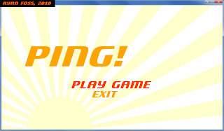
Start Menu
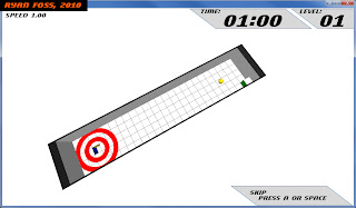
Dynamic Camera Fly at Level Start
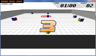
Countdown to Start
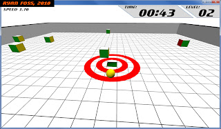
Game Play Example
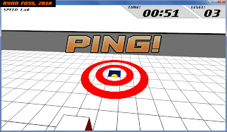
Win Condition, PING!
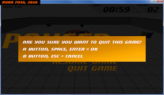
Menu Integration
The good news is it went well. Grades are in and I got a 90.04%, just eeking out the A. This was a wonderful surprise since I had accepted the fact I was probably going to get a B. Luckily everything with my game fell into place at the last minute and I completed the game (for the most part).
PING! is an action game where you control a ball. You decide which direction the ball should turn when it hits something. Concept was by Bill Nagel and me. It was programmed in XNA Game studio 3.1 (C# FYI). I did all the art assets, programming, source control (using SVN), etc. myself.
Here are some screen shots of my game.


Monday, June 7, 2010
Laser Shotgun
This is my newest creation. If all goes well, it will be added to Deadly Chambers. It is a shotgun that shoots lasers!
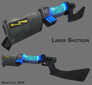
It was made using Blender and Photoshop. I rendered an AO layer and saved it, then a light layer, the blue glow, by rendering only the light on a dark material to the same UV map. I combined them in photoshop with some metal textures, photos, hand painting and some layer effects. I really like how it turned out.

It was made using Blender and Photoshop. I rendered an AO layer and saved it, then a light layer, the blue glow, by rendering only the light on a dark material to the same UV map. I combined them in photoshop with some metal textures, photos, hand painting and some layer effects. I really like how it turned out.
Labels:
android,
art,
blender,
deadly chambers,
freelance,
low polygon,
modeling,
video games
Monday, May 31, 2010
Portfolio
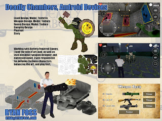
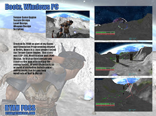
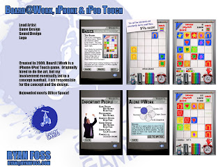
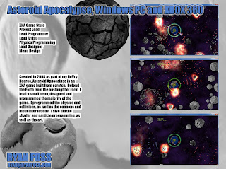

Technically, this post is because I have a deliverable for my Senior Project GSP-490 class, and the website they ask us to use can't upload images. I'm not really satisfied with my design, but I've got lots more other stuff to do (bad grammar intended).
Tuesday, May 18, 2010
It's Live: Deadly Chambers
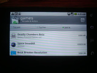
We finally released the game!!! It's called Deadly Chambers Beta. It's available on Android GL ES 2.0 compatible phones, like the Droid, N1, Incredible, Devour, and a few others.
It's "beta" because Rob is going to Google I/O this week and he wanted it in the market before he goes. Makes total marketing sense.
I have to say its really fun.
Wednesday, April 28, 2010
Tower In Action
I'm finishing the tower level tonight. It's mostly the little things that take the time. I had to make a quad for every torch, some for portal detection, etc. Here is a shot of the tower level being played. This is the stairs.
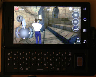
Here you are in first person mode standing on the roof.
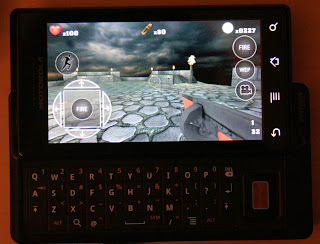
That is a Verizon Droid phone if you're wondering.

Here you are in first person mode standing on the roof.

That is a Verizon Droid phone if you're wondering.
Labels:
android,
art,
freelance,
low polygon,
video games
Monday, April 26, 2010
Tower Power, Shared Texture Space
This is the lightmap layer of the tower level for the game I'm working on with Rob of Battery Powered Games. This is the final level, the Tower, where the big show down with a magical wizard takes place. The game should be out in a month (estimated release second week of May, 2010). It's called [NAME TBD].
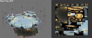
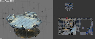
I've been using blender solidly for about half a year now and I have developed a number of tricks. My favorite trick thus far is baking textures with shared texture space. Essentially I design a symmetric scene, set up the lights and UV only part the model. I then use this part of the model to create the rest of the scene, but I push their UV's out of the main UV space. This is a trick, since Blender won't bake the textures for these faces (when they would normally cause problems), and they are technically in the same place if texture mode set to repeat.
Here you can see the UV texture space. The faces pushed to the top are part of the stairs design, while the parts pushed to the right are levels.
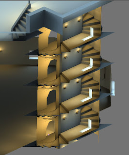
In this image you'll see that the stairs have essentially the same texture mapping from one level to the next. What is really nice is that since they are the same, they share the same UV texture space, I reap the benefits of the resolution only doing it once. It might seem really weird but its backfaces only. This means you see through geometry from one side, but not the other. So you can see the stairs through the walls so to speak. It's so natural to me, but I expect some won't know what they are looking at.
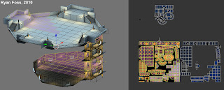
Here you can see I've highlighted the portions of the texture in the main UV space. Pretty good use of the space I think.

I've been using blender solidly for about half a year now and I have developed a number of tricks. My favorite trick thus far is baking textures with shared texture space. Essentially I design a symmetric scene, set up the lights and UV only part the model. I then use this part of the model to create the rest of the scene, but I push their UV's out of the main UV space. This is a trick, since Blender won't bake the textures for these faces (when they would normally cause problems), and they are technically in the same place if texture mode set to repeat.
Here you can see the UV texture space. The faces pushed to the top are part of the stairs design, while the parts pushed to the right are levels.

In this image you'll see that the stairs have essentially the same texture mapping from one level to the next. What is really nice is that since they are the same, they share the same UV texture space, I reap the benefits of the resolution only doing it once. It might seem really weird but its backfaces only. This means you see through geometry from one side, but not the other. So you can see the stairs through the walls so to speak. It's so natural to me, but I expect some won't know what they are looking at.

Here you can see I've highlighted the portions of the texture in the main UV space. Pretty good use of the space I think.

Labels:
android,
art,
blender,
deadly chambers,
freelance,
low polygon,
modeling
Tuesday, April 20, 2010
Fun in 3D, Tron Style
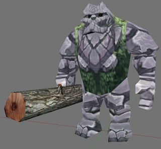
Rock Giant
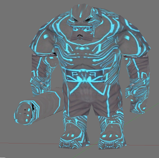
Rock Giant Tron Style
This is my latest model for NAME TBD. Obviously not going to use the Tron style version, but it gave the developer a laugh.
Subscribe to:
Comments (Atom)


